James Cropper unveils ‘The Colours of Manchester’ at The Independent Paper Show
- Jun 12
- 2 min read
Print Solutions
Master papermaker James Cropper has unveiled The Colours of Manchester at the inaugural Manchester edition of The Independent Paper Show 2026, transforming the city’s architecture, atmosphere and cultural identity into a living paper palette shaped by place, memory and observation.
Created in collaboration with Winter & Company, the campaign explores the idea that cities are often recognised through colour long before they are recognised through landmarks. Through street photography and observational storytelling, The Colours of Manchester captures the tones that quietly define the city: rain darkened streets beneath tramline yellow, industrial brick softened by northern light, shifting blues reflected through glass towers and canal water, and the muted mineral greys carried across Manchester skies.
The final palette distils the city into six core Coloursource expressions – Vermillion, Azure, Bright Yellow, Grey, Chartreuse and Mandarin – each translated through the Coloursource collection. These were whittled down from a broader field of observed tones drawn directly from Manchester’s streets, structures and atmosphere. Rather than naming colours abstractly, the project anchors them to places and visual fragments already embedded within the city’s collective memory.
‘Before colour becomes branding, it is place,’ said Jordan Scott, head of marketing for James Cropper. ‘Manchester has a visual language entirely its own, shaped by weather, music, architecture, sport and industry. This project was about observing those details closely and translating them into paper in a way that feels emotionally true to the city.’
Ahead of the show, the company launched a social first teaser campaign asking people across Manchester a simple question: What colour is Manchester?
Responses ranged from references to the city’s tram network and worker bee iconography to observations drawn from canal water, football culture, brickwork, and overcast skies. The resulting conversations became part of the project itself, building a collective portrait of the city through personal interpretation and shared visual memory.

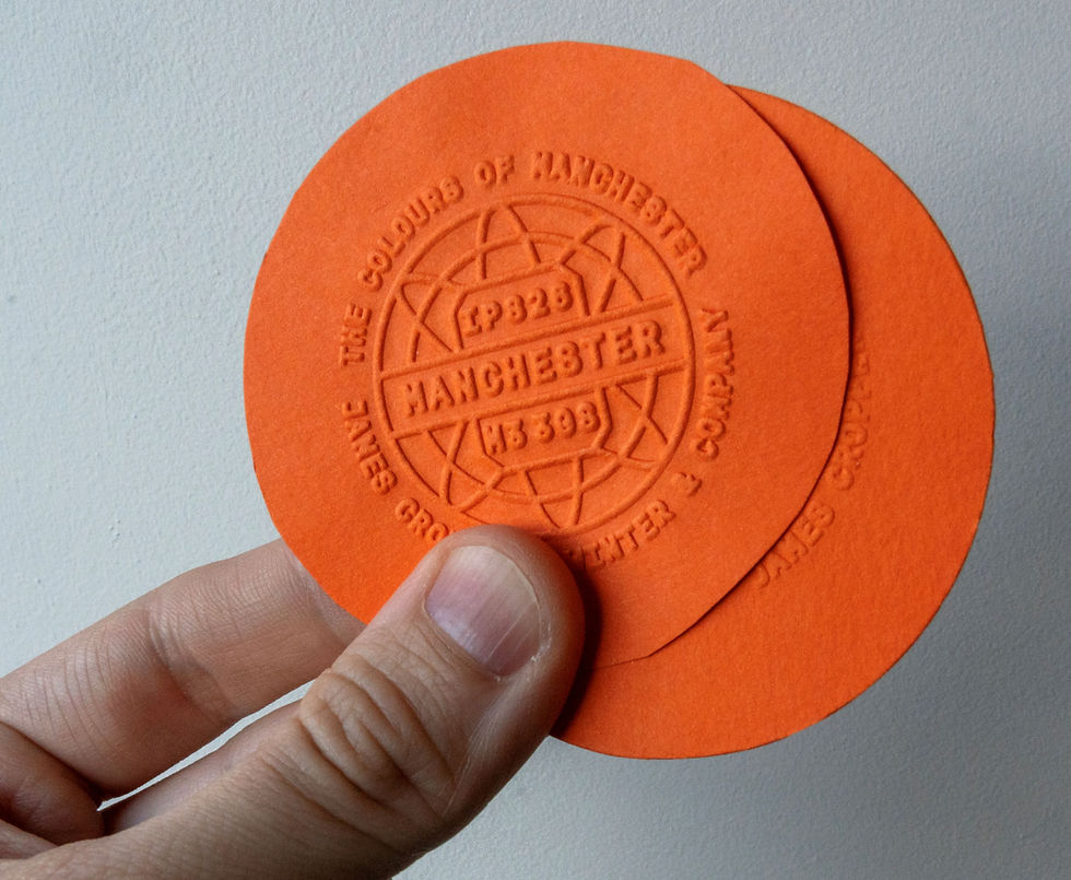
Presented through a deliberately stripped back exhibition space, the installation focused on a curated palette of Manchester inspired colours displayed through large scale photography, tactile paper applications and embossed takeaways produced at the company’s historic mill in Cumbria. Visitors were invited to select and emboss their own interpretation of Manchester’s defining colour, transforming the stand into an evolving study of the city’s identity.
Blending heritage papermaking with contemporary cultural observation, The Colours of Manchester positions paper not simply as a substrate, but as a medium capable of carrying atmosphere, identity and emotional permanence. In doing so, the project reframes colour not as something invented in isolation, but as something discovered within the landscapes, structures and stories people already instinctively recognise.


